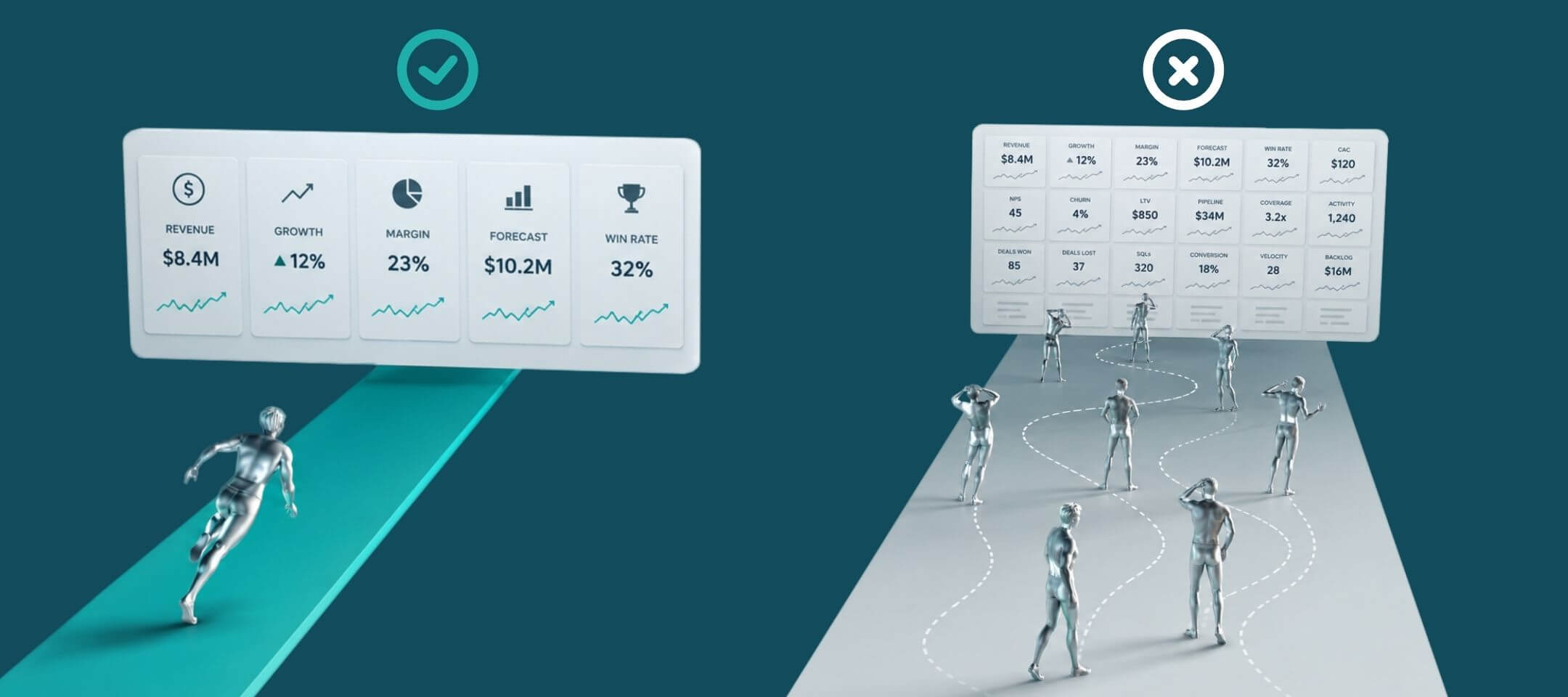

Your team probably has dashboards already. That’s usually the problem. Most sales orgs don’t lack performance data, they lack one view that changes what a manager does on Tuesday morning. The hard part isn’t building the board. It’s deciding which of the several hundred things your CRM can measure actually earn a place on it, and which layer of the team should see each one. This guide covers what belongs on a sales performance dashboard, who each metric is for, and how to build one your team opens without being told to.
Key takeaways
- A dashboard and a report answer different questions. A dashboard shows what’s happening now and prompts action during the period. A report summarizes a finished period for study. Confusing the two is why most boards quietly turn into monthly rituals nobody opens between reviews.
- Three failure patterns account for most abandoned dashboards: the board became an inventory of every available field, the metrics were chosen for the monthly review instead of the daily decision, or one board tried to serve every layer of the team at once.
- Every metric that survives should pass the action test: what would a rep or manager do differently in the next two hours if this number moved? Weight the mix toward activity inputs, roughly two to one against outcomes, and keep at least one outcome visible for diagnosis.
- Three to five metrics per audience layer is the practical ceiling. Past that, people stop scanning the board and start searching it, which erases the dashboard’s only real advantage over a report.
- Adoption, not design, is the real test. If people open the board unprompted and quote it in conversations you weren’t part of, it’s working. If adoption is flat after a month, cut back to three metrics tied to one decision and rebuild.
What a sales performance dashboard is
A sales performance dashboard is a single live view showing how reps, teams, and the wider sales organization are tracking against target, built from activity and outcome metrics pulled automatically from a CRM or dialer. Unlike a static report, it updates continuously, so managers can act during the period instead of reviewing it afterward.
That definition sounds obvious until you test an existing board against it. Plenty of what gets called a dashboard inside sales orgs fails on the second half, because it updates on a schedule rather than continuously, or because nothing on it prompts an action. Two comparisons make the distinction concrete.
How a dashboard differs from a sales report
A dashboard answers what’s happening now. A report answers what happened over a finished period. The practical test is timing, not format.
If the fastest thing you can do with the information is raise it at the next review, you’re looking at a report regardless of how it’s styled. Reports are useful, and they carry the analytical weight a dashboard can’t. Trend lines, cohort comparisons, and forecast accuracy all belong in a report because they reward study rather than a glance.
The failure mode is a board that quietly becomes a report. Nobody decides to make that change. It happens when the metrics chosen only make sense in hindsight, so people stop opening the board between reviews. Six weeks later it’s a monthly ritual with real-time plumbing underneath it that nobody uses.
How a dashboard differs from a sales scorecard
A dashboard aggregates across a team so leaders can spot patterns. A sales scorecard measures one rep against a weighted set of targets so a manager can coach specifics.
The two get used interchangeably, and it causes real confusion in tool evaluations. A team buys something to fix coaching and gets an aggregate board, or buys visibility tooling and expects it to tell a manager what to say in a one-on-one. Neither disappointment is the product’s fault.
Think of the dashboard as the team’s weather map and the scorecard as one rep’s forecast. You want both. Only one of them tells an individual what to do next.
Why most sales performance dashboards stop getting opened
Most sales performance dashboards fail because they were built to be complete rather than to be acted on. Completeness feels responsible while you’re building. It’s what produces a board with 22 widgets that nobody can read in five seconds.
The cost is measurable. Gartner’s Seller Skills Survey of 1,026 B2B sellers found that half of sellers feel overwhelmed by the amount of technology their role requires, and overwhelmed sellers are 45% less likely to attain quota. Salesforce puts the average at eight tools per rep to close a deal, with 42% of reps saying the number overwhelms them. A dashboard nobody asked for is a ninth tool.
Three patterns account for most of the abandonment, and they’re worth recognizing because each one has a different fix.
The board became an inventory of every available field
This is the most common failure and the easiest to diagnose. Someone opens the reporting builder, sees the list of available fields, and starts adding the ones that look useful. The board ends up describing the data model rather than the decision.
The reason it happens is that building forward from available data feels productive. Every widget added is visible progress, and no single addition seems unreasonable. The damage is cumulative rather than individual, which is why nobody catches it during the build.
What goes wrong is subtler than clutter. When a board carries 20 metrics, managers can’t tell which one leadership actually cares about, so they fall back on the number they already trusted before the board existed. You’ve spent three weeks building something that changed nobody’s behavior. Worse, the board now competes with the spreadsheet it was meant to replace, and the spreadsheet usually wins because it’s familiar.
The metrics were chosen for the monthly review
A board built to answer leadership’s quarterly question will not answer a manager’s Wednesday question. Both are legitimate. They’re not the same board.
Quarter-to-date revenue, attainment percentage, and win rate are all reasonable things to know. None of them tell a pod manager who to talk to before Friday. So the board gets opened when it’s needed, which is once a month, and the real-time sync underneath it goes to waste.
The tell is easy to spot. Ask a frontline manager what they’d do differently in the next two hours based on what the board currently shows. If the honest answer is nothing, you’ve built a leadership board and handed it to managers. The fix is a second layer rather than a redesign, because the leadership view was probably correct for its audience.
One board was built to serve every layer of the team
A rep, a frontline manager, and a VP need the same underlying data at three different resolutions. Compress that into one view and you get something that’s too coarse to coach from and too granular to run a region with.
This one usually comes from good intentions about a single source of truth. Consistency across the org is genuinely valuable, and the instinct to avoid competing versions of the number is right. The mistake is confusing consistent definitions with an identical view. You want the first without the second.
The consequence lands hardest on the middle layer. Leaders get a roll-up they can live with, reps get their own number somewhere on the board, and frontline managers get neither the rep-level detail they coach from nor the clean top line they report upward. They rebuild their own version in a spreadsheet, which reintroduces exactly the fragmentation the single board was meant to solve.
The appetite for better visibility is real, which is what makes the abandonment rate frustrating. In Salesforce’s 2026 State of Sales research, lack of access to data and insights was the top obstacle to effective enablement cited by millennial, Gen X, and baby boomer sellers. People want the board. They just won’t use one that doesn’t answer their question.

The metrics that belong on a sales performance dashboard
The metrics that belong on a sales performance dashboard are the ones that would change what someone does in the next few hours. Everything else is context, and context belongs in a report.
Three filters get you to a short list. Test each candidate for whether it prompts action, balance the inputs against the outcomes, and assign each metric to the layer of the team that can actually influence it.
Run every metric through the action test
The action test asks one question of every candidate metric. What would a rep or manager do differently in the next two hours if this number moved?
Revenue year-to-date almost never passes. It’s a real number, it matters to the business, and no rep can influence it before lunch. Calls logged today against a daily target almost always passes, because a rep who’s three behind at 2pm knows precisely what to do about it.
The test is deliberately narrow. Narrow is the point, because a board that survives it stays short enough to scan. It also settles arguments quickly. When someone insists a metric belongs, asking what action it triggers usually produces either a specific answer that justifies inclusion or a pause that settles the matter.
Where it fails is with genuinely diagnostic metrics that need a longer window, like ramp time for new hires or sales cycle length. Those matter, and they don’t produce a two-hour action. Send them to a monthly report rather than bending the test to accommodate them.
Balance activity metrics against outcome metrics
A dashboard built only from outcomes tells people they’re behind without telling them why. A dashboard built only from activity rewards motion and never checks whether the motion converts.
Activity metrics like calls, meetings booked, and pipeline added are inputs a rep controls today. They’re what makes a board actionable, and they’re the reason activity-driven teams get more out of dashboards than relationship-led ones. Outcome metrics like win rate, attainment, and average deal size confirm whether the activity is producing anything.
Weight the mix toward inputs, roughly two to one, and keep at least one outcome visible. The reason for keeping the outcome is diagnostic. When activity is healthy and the outcome isn’t moving, the problem is conversion quality rather than effort, and that’s a coaching conversation rather than a motivation one. A board with no outcome metric can’t tell you which of those you’re dealing with.
Build a separate layer for each audience
Each layer of the sales org needs a different resolution of the same data. Building three layers is less work than it sounds, because the underlying metric definitions are shared and only the aggregation and detail change.
What a rep needs to see. A rep needs to know whether they’re on pace right now and what their next action is. That means activity against a daily or weekly target, their own conversion rate at the stage where they’re weakest, pipeline added this week, and progress toward the current quota period.
Personal comparison matters more than team comparison here. A rep who sees only the team total has no idea whether they’re the reason it’s healthy. Progress against their own assigned target is the number that changes behavior, which is also why ranking on percentage of individual target works better than ranking on raw output.
What a frontline manager needs to see. A frontline manager running a pod of five to twelve reps needs to know who requires attention before the week ends. That’s activity by rep against individual target, rep-level conversion at the weakest stage, deals slipping backward, and coverage against the team number.
This is the layer where real-time refresh earns its cost. A manager who finds out on Monday that a rep missed last week can only discuss it. A manager who sees it drifting on Wednesday can change the outcome. The difference between those two positions is the entire argument for a live board over a weekly report.
Rep-level granularity is non-negotiable at this layer. A pod average hides the two people who need help, and it’s the most common reason managers abandon a board and rebuild it themselves.
What a sales leader needs to see. A sales leader needs to know which teams or regions are drifting and whether the shape of the pipeline is healthy. Attainment by team, stage conversion trends, pipeline coverage ratio, and ramp status for new hires cover most of it.
Daily refresh is enough at this layer, and pushing for real-time here tends to encourage the wrong behavior. A leader watching hourly movement starts asking pod managers about intraday noise, which pulls those managers into reporting upward instead of coaching down. The board should support weekly decisions about where to direct attention, not minute-by-minute monitoring.
Here’s how the three layers compare in summary:
Why three to five metrics is the practical ceiling
Three to five metrics per layer is where boards stop being scannable. Past five, people stop reading the board and start searching it, which removes the only real advantage a dashboard has over a report.
The number isn’t arbitrary. It reflects what someone can absorb in the few seconds they’ll actually give it while walking past a screen or checking a phone between calls. A board that needs deliberate study has already lost to the report format it was meant to replace.
If you’re still deciding which measures deserve a slot, our breakdown of sales performance metrics works through the selection logic, and setting targets that drive daily behavior covers how to ground each metric in a number reps consider fair.
Five steps to build a sales performance dashboard
To build a sales performance dashboard, define the decision it supports first, then choose metrics backward from that decision. Building forward from available data is how you end up with 22 widgets.
Step 1. Name the decision the board has to support
Write the decision as a single sentence before you open any builder. Something like “a pod manager decides who to coach before Thursday” works, because it names a person, an action, and a deadline.
One board, one decision. If you have three decisions, you have three layers, and knowing that upfront prevents the compromise board that serves nobody. This step takes fifteen minutes and saves the rebuild.
The sentence also becomes your acceptance criteria. When someone proposes adding a widget, you can ask whether it helps that specific person make that specific decision. Most proposals don’t survive the question, which is exactly what you want.
Step 2. Choose three to five metrics that pass the action test
Run every candidate through the action test from the previous section, weight toward inputs, and stop at five.
For each metric you keep, write down the action it should trigger. A metric with no matching action is decoration, and writing the action out is the fastest way to find the decoration. This documentation also helps six months later when someone asks why a particular number is on the board.
Resist the urge to include a metric because a stakeholder will ask about it. If leadership needs a number that fails the action test for managers, that number belongs on the leadership layer. Adding it to the manager board to preempt a question is how boards grow to 22 widgets one reasonable addition at a time.
Step 3. Fix the definitions before you build anything
Agree what counts as a qualified opportunity, what counts as an activity, and how periods are bounded. Do this before building, because retrofitting definitions onto a live board means every historical comparison breaks.
Definition drift is the most common reason a shared board loses trust, and it’s almost invisible while it happens. One region starts counting a discovery call as a meeting and another doesn’t. Someone adjusts what qualifies as a genuine opportunity mid-quarter. Six months in, two managers quote different numbers in the same meeting, and everyone concludes the board is wrong rather than that the definitions diverged.
The three definitions that break most often are the stage a deal enters when it becomes real, whether an activity counts when logged or when completed, and whether a period closes on a calendar date or a business date. Settle those three explicitly. For multi-region teams, our guide on keeping one shared real-time view honest covers who should own those definitions once the board is live.
Step 4. Set thresholds so status is readable without arithmetic
A number on its own makes the reader calculate whether it’s good. A number against a threshold does that work for them, which is the difference between a board someone scans and a board someone studies.
Set the threshold at the level the target implies, not at a round number that feels tidy. If a rep needs 40 calls a week, the mid-week threshold is 24 rather than 20, because 20 looks like halfway and is actually behind pace. Getting this wrong teaches people that green means nothing, and once that happens the color scheme is decoration.
SalesScreen applies these thresholds automatically on every dashboard widget: green for on track, yellow for 50 to 99% of target, and red for anything below half. A manager scanning a board sees where to step in before reading a single figure, which is what makes a wall-mounted screen useful rather than ambient noise.
Step 5. Put the board where the team already looks
A board behind two logins gets checked weekly at best. Placement determines adoption more than design does, and it’s the step most often skipped because it feels like an afterthought.
Office screens work for activity-driven floors because the data becomes ambient rather than something to retrieve. Mobile matters for field and hybrid teams who won’t be at a desk when the number changes. Posting milestones into the channels a team already watches reaches people who wouldn’t open a dashboard at all.
Then pair placement with a rhythm. Visibility without a reporting cadence still produces reactive management, because a live board that nobody has a standing reason to review is just a faster way to find out late.
One technical caveat before you promise anything. Whether a board updates in real time depends entirely on how your source systems connect. Most CRM and dialer integrations sync on an interval measured in minutes rather than instantly, which is fast enough for coaching decisions and not fast enough for something you’d want to celebrate on screen the second it lands.
Sales performance dashboard examples for three team types
Sales performance dashboards differ by sales motion, because the activities that predict a good month aren’t the same across industries. The structure of the org matters as much as the metrics.
Insurance agency with multiple locations
An insurance dashboard runs on advisor activity against binder or production targets, quotes issued, policies bound, and cross-sell rate per advisor, split by location.
The multi-location split usually is the point. A strong agency average can hide two struggling offices, and a regional director who only sees the roll-up finds out about the gap when the quarterly number lands. Splitting by location turns one number into a comparison, and the comparison is what prompts a site visit.
Consistency across offices is the constraint here rather than depth. If one location counts a quote differently from another, the comparison that makes the board valuable becomes the reason people distrust it.
Mid-market SaaS with an SDR and AE split
A SaaS team needs separate layers rather than one board, because SDRs and AEs are measured on different things and comparing them directly makes the board feel unfair.
SDRs run on activity and meetings booked against a weekly target, where volume is genuinely the job and real-time standing drives behavior. AEs run on pipeline created, stage conversion, and coverage against quota, where a weekly view is enough and daily volume tells you very little.
Merging them into one leaderboard is a common early mistake. It implies the two roles are comparable, which reps notice immediately, and it usually results in whichever group has the higher raw numbers permanently occupying the top of the board.
Financial services with a branch or pod structure
A financial services board tracks advisor meetings held, product penetration, referrals generated, and attainment rolled up from advisor to pod to region.
Cross-sell and product penetration carry more weight here than raw activity volume, because the growth usually comes from depth within existing relationships rather than new logos. That changes which metric earns the top slot on the board.
Roll-up consistency matters more than granularity at the top layer. When a head of growth acts on a regional number, that number has to mean the same thing in every branch, or the decision it prompts is based on a definition mismatch rather than a performance gap.
Across all three, the same rule holds. If a rep can’t influence a metric this week, it belongs on a leadership board rather than a rep-facing one.
How to tell whether your dashboard is working
You can tell a sales performance dashboard is working when people open it without being asked and quote it in conversations you weren’t part of. Adoption is the honest signal, and it’s easier to read than any usage report.
Adoption signals worth watching in the first month
Four things tell you whether the board landed. Whether one-on-ones now start with the board instead of a spreadsheet, which means managers trust it enough to coach from. Whether managers are catching problems mid-week rather than at month-end, which is the behavior change the board exists to produce.
The third signal is whether two people in the same meeting still cite different numbers. That points at definitions rather than design, and no amount of layout work will fix it.
The fourth matters most and gets watched least. Whether reps reference their own standing unprompted, which is the clearest evidence the data reached the people whose behavior you’re trying to change. A board that only managers use has improved reporting rather than performance.
What to do when nobody opens it
If adoption is flat after a month, the board almost certainly answers a question nobody was asking. Cut back to three metrics tied to one decision and rebuild from there.
Trimming a dashboard nearly always improves it. Adding to one rarely does, and the instinct to fix low adoption by making the board more useful through additional metrics makes the original problem worse. Start from the decision again rather than from the board you have.
One related trap is worth flagging before you add a leaderboard. A single-metric ranking will get gamed, and reps will optimize the one displayed number at the expense of everything else. Our guide to weighted scoring for sales leaderboards covers how to assign point weights so the behaviors you care about actually count.
Start with three metrics, not thirty
A sales performance dashboard earns its place when every metric on it points to an action someone can take today, and when each layer of the team sees the resolution that matches their job. Pick one decision, choose three metrics that would change it, and settle the definitions before you build a single widget.
That’s also where a platform stops being a nice-to-have. Turning a live board into changed behavior is what SalesScreen is built for, connecting real-time performance data to the competitions and recognition that keep reps acting on it daily, which is why customers consistently report a 30% KPI increase within the first six months. Book a demo to see it running against your own metrics.
Frequently asked questions
What is the difference between a sales dashboard and a sales report?
A sales dashboard shows current performance against target and updates continuously, so it supports decisions during the period. A sales report summarizes a completed period and supports analysis after it. The practical test is timing. If the fastest thing you can do with the information is discuss it at the next review, you’re looking at a report.
How many metrics should a sales performance dashboard have?
Three to five per audience layer. Past that, people stop scanning the board and start searching it, which removes the main advantage a dashboard has over a report. If a metric can’t be tied to a specific action someone would take today, move it to a monthly report rather than expanding the board to accommodate it.
Should reps see each other’s numbers on a sales dashboard?
In most activity-driven teams, yes, provided the comparison is fair. Ranking reps on raw output favors whoever has the best territory or the longest tenure. Ranking on percentage of an individually assigned target compares effort rather than circumstance, which is what keeps middle performers engaged instead of resigned.
Do you need a BI tool to build a sales performance dashboard?
Not necessarily, and many teams run both. BI tools like Power BI or Tableau are built for strategic reporting and flexible analysis. Sales performance platforms are built for daily use by reps and frontline managers, with target thresholds and real-time updates already handled. Choose based on who opens it every day.