
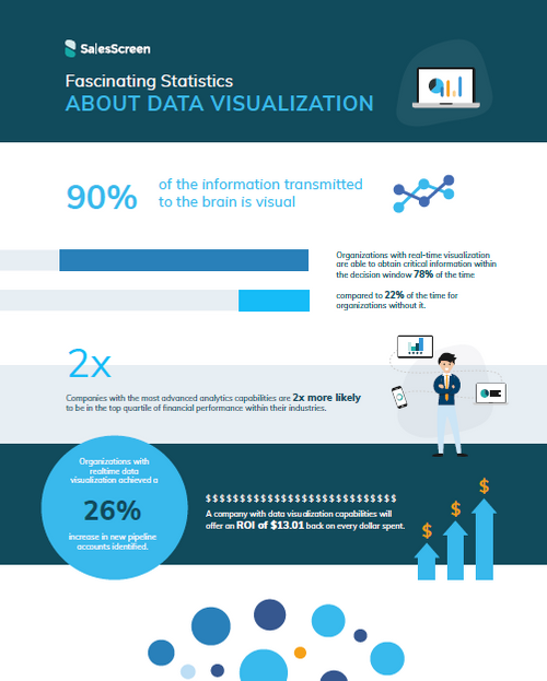
Fascinating Statistics About Data Visualization [Infographic]
Want to learn why a picture really does speak a thousand words? This infographic is for you.
Learn more
See all Resources

Mind The Motivation Gap
You think you know what motivates your team, but do they agree? Motivating a sales team is challenging in the best of times. During the last three years, however, leaders have had to do so even as they navigated global calamity and workforce changes.
View content


How To Build Sales Culture For Scattered Teams
Remote and hybrid sales teams are here to stay, and leaders who want to build a positive, engaging culture will have to learn some new tricks
View content

How to build sales culture for scattered teams
Remote and hybrid sales teams are here to stay, and leaders who want to build a positive, engaging culture will have to learn some new tricks.
View content

Stop burnout in its tracks
Burnout—if you’ve been there, you know. And too many have. In fact, a recent survey from Indeed.com showed that 67% of all workers surveyed said burnout has worsened in the pandemic.
View content

From Pain Points to On Point In 2022
4 of your most common challenges, solved.
View content


Love the Game
How Gamification Inspires Sales Teams to Do More and Have Fun
View content